Create logo for online equine magazine
- Status: Closed
- Prize: $130
- Entries Received: 109
- Winner: SoyCarola

Contest Brief
We would like like help with creating a logo for a new, Norwegian online equine (horse) magazine. It is going to be a simple, minimalistic logo, maybe even text only. Focus being on simplistic, elegant and clean design, and not too much things going on. But a detail of part of a horse implementet in the logo would be a nice touch (like the part of the mane of a horse running or similar detail, please see attached PDF for picture examples of details to implement in logo and more detailed description). Please no rearing horse, horse shoes or other cliché horse images, only subtle details of a horse in a logo. Black/Grey mainly, but addition of neutral or natural/earth/robust colors could also be fine. Not too colorful.
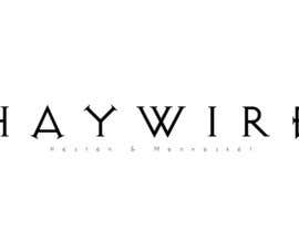
The name of the online magazine is "Haywire." It also has an extra text we want to be part of the logo. "Haywire - Hesten & Mennesket" (This means Haywire - Horse & Human). The text "Hesten & Mennesket" can be in a clean, minimalistic font, only upper-case capital letters is fine.
This master logo will be centered on the web page header with a white background. Please see some simple examples and more details in the attached PDF. Please read entire PDF before submitting your design to this contest.
Please note: We also want the winner of this contest to provide us with a few different versions of the logo (Favicon, logo fitted for Facebook profile picture and logo with transparent background), as well as the vector files of the logo. Please read the attached PDF for all details of what we want. Please read this before entering the contest so you know what is part of the price money. Please be aware we might want some minor details changed to your entry design. All design must be your own, not copied from elsewhere.
UPDATE: The font for the name "Haywire" might also be kind of a handwritten font, and the rest of the text in a more minimalistic font. Or vice versa. Or boths elements using similar fonts as in the PDF as example. You are free to show what you think works best.
Recommended Skills
Employer Feedback
“We are very happy with the logo SoyCarola made for us. It was clean, simple and to the point, just what we had wished for. She was also positive to do some minor changes to the logo and provided these changes fast. She had read the contest description well and provided everything we asked for. We are very satisfied with her work! ”
![]() trinebhnsdalen, Norway.
trinebhnsdalen, Norway.
Public Clarification Board
How to get started with contests
-

Post Your Contest Quick and easy
-

Get Tons of Entries From around the world
-

Award the best entry Download the files - Easy!