Campaign Logo Design.

  • Status: Closed
  • Prize: $100
  • Entries Received: 101
  • Winner: tinkaedgar

Contest Brief

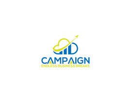
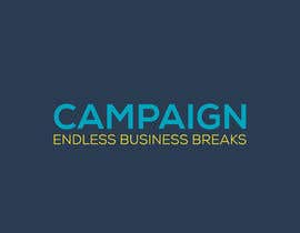
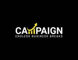
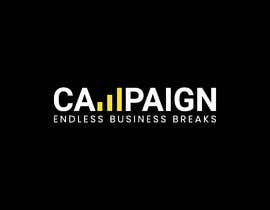
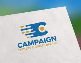
Create a logo design for Campaign digital marketing company
Attached are the colors we use.
I would prefer minimal color use in the logo.
If you decide on a single color for the icon, I would prefer the yellow one (See attachment for exact color code) Otherwise feel free to choose your color combinations for the icon.

Company name: Campaign
Tagline (Optional): Endless Business Breaks
What we do: Digital marketing mainly lead generation.
Target customers: SMEs.


IMPORTANT ***UPDATES BASED ON RESULTS AND MISCONCEPTIONS FROM YESTERDAY***
Dear artists, here are A few notes to help move towards success based on previous submissions.

1) The font shouldn't be too corporate. It should strike a balance between corporate and playful.
2) I prefer thicker font to thin font. ( more like semi bold or bold if it isn't too much )
3) I prefer to see the logo on a white background but would love the dark background version too.
4) This is an online-based company so usage will be mainly web and phone. (Shop display is good but doesn't count much)
5) The yellow in the attachment shouldn't be a dominant color in the logo. Should be used sparingly as a highlighter.
6) I prefer text in a dark color. Use bright colors in text very sparingly.
7) Simple is always better.
8) I am looking out for creative icons. Icons that represent digital marketing or lead generation or customer acquisition. Example of icons could be
a) Magnet to symbolize customer attraction
b) Graph,
c) Analytics dots,
d) Arrow
e) Anything that symbolises upward movement.
c) A screaming bird to symbolize communication
9) Icons not to use: plane, rocket.
10) Please use colors in the attachment. (Black is the only exception so you can use it if you feel it helps the look of your design)
11) Black is not in the attachment but its acceptable.
12) The logo should give off a general feel of a marketing tech startup or company.
13) Please use flat icons.
14) If you decide to use plain font without an icon, please modify at least one letter in the font to make it look unique.
15) Logos that use negative space technique are great as well.
16) If you want to use a premium font and you don't have it, let me know, If it appeals to me, I may be able to obtain it for you.
17) Simple clean and elegant is best.

I don't want to give too much information as it restricts designers and hope for designers to be creatively free,
but I hope this will result in fewer rejections

More Logos that I find attractive. Note (There is no common denominator here other than they are clean elegant simple and attractive)
https://bit.ly/3gRlUl2
https://bit.ly/32aRxC2
https://bit.ly/3gPglDt
https://bit.ly/2W8sMCk
https://bit.ly/3286iFu
https://adifferentkindoftired.com/
https://bit.ly/32aOc5U

Lastly, please forgive me if your logo was rejected. The outline above summarises the reasons for most rejections.
Feel free to ping me for any questions clarification or need.

Recommended Skills

Employer Feedback

“Understood the drive behind our ask and created something that addressed all our stress points. Highly recommended.”

Profile image ayebare11, Uganda.

Top entries from this contest

View More Entries

Public Clarification Board

  • Graphicbuzzz
    Graphicbuzzz
    • 3 years ago

    Kindly check entry #1000 #1001 a negative space logo concept.Thanx

    • 3 years ago
  • vkjoybd
    vkjoybd
    • 3 years ago

    check it #1032

    • 3 years ago
  • AnisDGN
    AnisDGN
    • 3 years ago

    Sir,Kindly check my new design #1028

    • 3 years ago
  • vkjoybd
    vkjoybd
    • 3 years ago

    check it #1027

    • 3 years ago
  • vkjoybd
    vkjoybd
    • 3 years ago

    check it #1025

    • 3 years ago
  • vkjoybd
    vkjoybd
    • 3 years ago

    check it #1022

    • 3 years ago
  • vkjoybd
    vkjoybd
    • 3 years ago

    check it #1021

    • 3 years ago
  • AnisDGN
    AnisDGN
    • 3 years ago

    please wait

    • 3 years ago
  • Graphicbuzzz
    Graphicbuzzz
    • 3 years ago

    Kindly check entry #1000 #1001 a negative space logo concept.Thanx

    • 3 years ago
  • ayebare11
    Contest Holder
    • 3 years ago

    Thanks all for the submissions. As the contest comes to an end. The last concept we have is of a comet. Hope to get some comet submissions.

    • 3 years ago
    1. sahadatnew001
      sahadatnew001
      • 3 years ago

      Dear Contest Holder, could you check my entries #939 , #933 , #931 , #930 , #929 and #927 , Please? (Added comet according to your suggestions)

      • 3 years ago
    2. Graphicbuzzz
      Graphicbuzzz
      • 3 years ago

      Kindly check entry #1000 #1001 a negative space logo concept.Thanx

      • 3 years ago
  • Graphicbuzzz
    Graphicbuzzz
    • 3 years ago

    Kindly check #1000

    • 3 years ago
  • vkjoybd
    vkjoybd
    • 3 years ago

    check it #996

    • 3 years ago
  • AlexanderOrsk
    AlexanderOrsk
    • 3 years ago

    Good time of day
    Logo Campaign. #923 . #924 . #925 if it is not difficult,write
    the pros and cons of my work.I am sure that I can achieve
    a result that will suit you.

    • 3 years ago
  • taposiback
    taposiback
    • 3 years ago

    Please check # 915

    • 3 years ago
  • Shahina46
    Shahina46
    • 3 years ago

    Sir,please check my entries

    • 3 years ago
  • taposiback
    taposiback
    • 3 years ago

    Hi kindly check my new version, Hope you like it, Thanks

    • 3 years ago
  • ayebare11
    Contest Holder
    • 3 years ago

    Another idea that combines growth and tech https://www.freepik.com/free-vector/ecologic-smart-home-logo_1260594.htm

    • 3 years ago
    1. MrChaplin17
      MrChaplin17
      • 3 years ago

      okay

      • 3 years ago
  • ayebare11
    Contest Holder
    • 3 years ago

    Hello, the team examined all logos and unfortunately they didn't quite settle for any. But they do have an inclination towards line logos as opposed to solid and that's why we left that one logo.
    Examples of line logos https://www.pinterest.com/cezarbianchi/line-logos/
    Any logo that represents growth is ok even if the connection isn't so obvious. Currently removing restrictions. But, someone should be able to associate it to growth. Also use one color for whichever logo you choose. Thanks.

    • 3 years ago
    1. AymanebT
      AymanebT
      • 3 years ago

      Hi ! Do you want to see a leaf in the logo !?

      • 3 years ago
    2. AymanebT
      AymanebT
      • 3 years ago

      And could you please tell what is the most icon you are interested in like arrows / anytics dots / leaf !? Just to do a good job :) :) Thank You

      • 3 years ago
  • shovonahmed2020
    shovonahmed2020
    • 3 years ago

    check the entry #756

    • 3 years ago
  • ayebare11
    Contest Holder
    • 3 years ago

    Thanks for all concepts. After sharing them with the team, they requested to see some font only versions(i.e without an icon) before making a final decision. Kind regards.

    • 3 years ago
    1. GalibBOSS01
      GalibBOSS01
      • 3 years ago

      okkk

      • 3 years ago
    2. BestDesigner001
      BestDesigner001
      • 3 years ago

      Sir please check this variation #723. I hope you like this.

      • 3 years ago
  • BestDesigner001
    BestDesigner001
    • 3 years ago

    Sir please check my entry #701. New concept

    • 3 years ago
  • taposiback
    taposiback
    • 3 years ago

    Kindly check # 707

    • 3 years ago
  • taposiback
    taposiback
    • 3 years ago

    Please check # 699

    • 3 years ago
  • stevendomingo7
    stevendomingo7
    • 3 years ago

    please check #604

    • 3 years ago
  • jabedalamakash
    jabedalamakash
    • 3 years ago

    #586 check

    • 3 years ago
  • ayebare11
    Contest Holder
    • 3 years ago

    Still looking forward to seeing a great bird/ parrot logo design.
    - The parrot would have an open mouth to symbolize communication and tiny lines coming from the mouth to illustrate sound.
    - Here are two great parrot logo images that inspire a good logo.
    I think the bird is better with a bluish color and some yellow somewhere
    Also, the text is better darker.
    The bird should be having an open beak with sound-symbol to symbolize communication.
    The best bird type would be a parrot. Here are two great part logos to inspire your design
    https://contrast8.com/portfolio/talkivy-chat-bubble-language-logo-design/
    https://www.freepik.com/premium-vector/parrot-talk-bird-logo_2447231.htm

    • 3 years ago
  • jabedalamakash
    jabedalamakash
    • 3 years ago

    #574 check it...

    • 3 years ago
  • jabedalamakash
    jabedalamakash
    • 3 years ago

    #573 check and give me a review

    • 3 years ago
  • nurujjaman9082
    nurujjaman9082
    • 3 years ago

    Please Check #566

    • 3 years ago
  • ayebare11
    Contest Holder
    • 3 years ago

    Hello designers. A Few notes from today's reviews.
    - When providing a logo for review, kindly provide the flat surface version as well. I appreciate the paper print illustrations and shop signage illustrations but since we are a web-based agency, criteria is placed on how it appears on screen i.e the flat version. Therefore if you can, please provide the flat version (i.e how it appears on the web) For both light and dark backgrounds.
    - Lastly, there are still several icons at your disposal 1) The magnet 2) Upward Growth arrows 3) Speaking bird, 4) Megaphone.

    • 3 years ago
    1. greyspace07
      greyspace07
      • 3 years ago

      check #540

      • 3 years ago
  • nurujjaman9082
    nurujjaman9082
    • 3 years ago

    Check It #505

    • 3 years ago
  • nurujjaman9082
    nurujjaman9082
    • 3 years ago

    #502 Check it

    • 3 years ago
  • jabedalamakash
    jabedalamakash
    • 3 years ago

    #428 check it

    • 3 years ago
  • jabedalamakash
    jabedalamakash
    • 3 years ago

    #428 please check and give me rate

    • 3 years ago
  • ayebare11
    Contest Holder
    • 3 years ago

    Going to thoroughly check all images for copy paste work using google image search for the icon. I see lots of them already.

    • 3 years ago
    1. grv13
      grv13
      • 3 years ago

      Thanks, there are lots of copy cat designers

      • 3 years ago
  • menasobhy88
    menasobhy88
    • 3 years ago

    working....

    • 3 years ago
  • ArenaSunny
    ArenaSunny
    • 3 years ago

    WOT

    • 3 years ago
  • grv13
    grv13
    • 3 years ago

    Please Check #398

    • 3 years ago
  • grv13
    grv13
    • 3 years ago

    please check#368

    • 3 years ago

Show more comments

How to get started with contests

  • Post your contest

    Post Your Contest Quick and easy

  • Get tons of entries

    Get Tons of Entries From around the world

  • Award the best entry

    Award the best entry Download the files - Easy!

Post a Contest Now or Join us Today!