sna5b127439cb5b5
Bangladesh

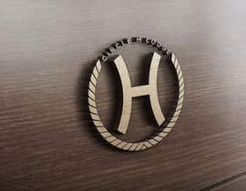
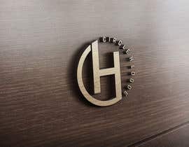
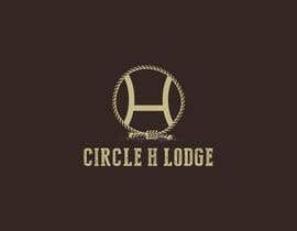
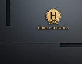
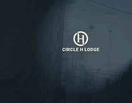
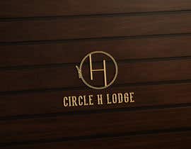
This is for a Old West themed lodge in Colorado in the US. The rope circle is playing on the name Circle H. It is a rope like an Old West rope used to lasso cattle. We have a first draft but want to make some changes. We would like the rope to look less computer generated and perfect. We would like the H in the middle to have less curve on the sides, and the cross bar in the H to be moved down so it is off center vertically. The first draft is attached. It would be great is the rope could be more hand-drawn, if that is possible. If not, here are some links to ropes we like a bit better:
http://clipart-library.com/clipart/888154.htm
http://cliparts.co/cliparts/Bcg/ER6/BcgER6ezi.gif
“Great work and very responsive.”
![]() burkeqsmith, United States.
burkeqsmith, United States.


Post Your Contest Quick and easy

Get Tons of Entries From around the world

Award the best entry Download the files - Easy!
