Design a logo for an erotic webshop

  • Status: Closed
  • Prize: €120
  • Entries Received: 275
  • Winner: graphicshape

Contest Brief

We want a senior designer who can design a logo for our erotic webshop.
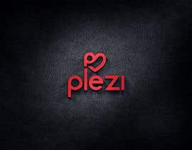
Logo should be attractive for both male and female.

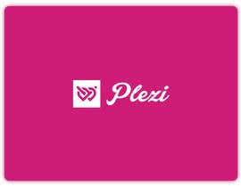
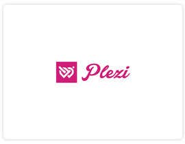
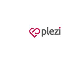
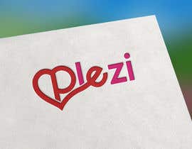
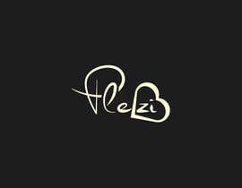
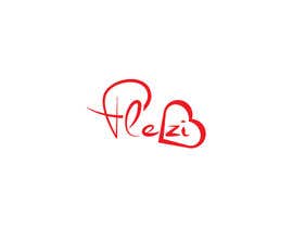
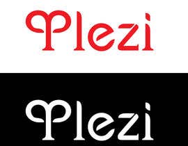
Name of the erotic webshop is 'Plezi'
The shop will contain all the items one might expect from an erotic shop... we have over 7.000 items in stock.

Logo should fit in the webshop's frame (see screenshot)
However don't mind the color(s), we will change the website according to the color(s) used in the logo.

We want the logo in vector, psd, png, pdf and jpeg.

Good luck and be creative, no stocklogo's or copies of other peoples design!

Recommended Skills

Employer Feedback

“Great, made some great entries in the competition and adjusted them based in the feedback given.”

Profile image WebKrunch, Belgium.

Top entries from this contest

View More Entries

Public Clarification Board

  • shojibbabu77
    shojibbabu77
    • 5 years ago

    kindly check #421 #422

    • 5 years ago
  • arjuahamed1995
    arjuahamed1995
    • 5 years ago

    Please check this #419 .

    • 5 years ago
  • SandipBala
    SandipBala
    • 5 years ago

    Hi, check my Entry #404, #405, #406, #407

    • 5 years ago
  • igenmv
    igenmv
    • 5 years ago

    please check entry #376 #377

    • 5 years ago
  • prashanthsbhat
    prashanthsbhat
    • 5 years ago

    Please have a look on the entry 375

    • 5 years ago
  • prashanthsbhat
    prashanthsbhat
    • 5 years ago

    Dear contest holder, Please have a look on the entry 374

    • 5 years ago
  • prashanthsbhat
    prashanthsbhat
    • 5 years ago

    Please check the entry 366 and 367

    • 5 years ago
  • classydesignbd
    classydesignbd
    • 5 years ago

    Please check my entry #362 #363 #364

    • 5 years ago
  • miade1155
    miade1155
    • 5 years ago

    Please check #331 #337

    • 5 years ago
  • miade1155
    miade1155
    • 5 years ago

    Please check #317 #318 #319 #320 #321 #322 #323 #324 #325

    • 5 years ago
  • DIPRAW
    DIPRAW
    • 5 years ago

    Sir, please check #334

    • 5 years ago
  • prashanthsbhat
    prashanthsbhat
    • 5 years ago

    Dear contest holder, Do not close the contest before date. I will come up with different concepts

    • 5 years ago
  • Nanthagopal007
    Nanthagopal007
    • 5 years ago

    i hope to like you , please check Entries #270 , #271

    • 5 years ago
  • monun
    monun
    • 5 years ago

    Please check my all entries: #243 #244 #245 #246 #247 . Thanks

    • 5 years ago
  • DIPRAW
    DIPRAW
    • 5 years ago

    Sir, please check these entries #230 , #231 , #232 and #234

    • 5 years ago
  • ronghintuli
    ronghintuli
    • 5 years ago

    #sealed, please

    • 5 years ago
    1. WebKrunch
      Contest Holder
      • 5 years ago

      ?

      • 5 years ago
  • rufom360
    rufom360
    • 5 years ago

    #sealed

    • 5 years ago
    1. WebKrunch
      Contest Holder
      • 5 years ago

      ?

      • 5 years ago
  • Nanthagopal007
    Nanthagopal007
    • 5 years ago

    i like your logo contest

    • 5 years ago
    1. WebKrunch
      Contest Holder
      • 5 years ago

      Thanks!

      • 5 years ago
  • DIPRAW
    DIPRAW
    • 5 years ago

    sir please check my another entry #32

    • 5 years ago
    1. WebKrunch
      Contest Holder
      • 5 years ago

      Not what we are looking for... don't see any link to an erotic shop whats-o-ever.

      • 5 years ago
  • DIPRAW
    DIPRAW
    • 5 years ago

    sir please check my entry #30

    • 5 years ago
    1. WebKrunch
      Contest Holder
      • 5 years ago

      Not what we are looking for... don't see any link to an erotic shop whats-o-ever.

      • 5 years ago
  • ushi123
    ushi123
    • 5 years ago

    sir can u pls check #44 thank you sir

    • 5 years ago
    1. WebKrunch
      Contest Holder
      • 5 years ago

      I feel the P is weird also the font is too square/harsch

      • 5 years ago
  • ushi123
    ushi123
    • 5 years ago

    sir can u pls check #46 thank you sir

    • 5 years ago
    1. WebKrunch
      Contest Holder
      • 5 years ago

      I feel the P is weird also the font is too square/harsch

      • 5 years ago
  • ushi123
    ushi123
    • 5 years ago

    sir can u pls check #46 thank you sir

    • 5 years ago
    1. WebKrunch
      Contest Holder
      • 5 years ago

      i feel the P is weird also the font is too square/harsch

      • 5 years ago
  • mdhelaluddin11
    mdhelaluddin11
    • 5 years ago

    #49

    • 5 years ago
    1. WebKrunch
      Contest Holder
      • 5 years ago

      Hmmm not really feeling it...

      • 5 years ago
  • ushi123
    ushi123
    • 5 years ago

    sir can u pls check #69 thank you sir

    • 5 years ago
    1. WebKrunch
      Contest Holder
      • 5 years ago

      Too generic...sorry

      • 5 years ago
  • Synthia1987
    Synthia1987
    • 5 years ago

    #71

    • 5 years ago
    1. WebKrunch
      Contest Holder
      • 5 years ago

      Looks too much like a escort site log

      • 5 years ago
  • WHITE645
    WHITE645
    • 5 years ago

    sir,please check #99

    • 5 years ago
    1. WebKrunch
      Contest Holder
      • 5 years ago

      Like this, can you work out some variations?Not a big fan of the 'P'.

      • 5 years ago
  • bambi90design
    bambi90design
    • 5 years ago

    #110

    • 5 years ago
    1. WebKrunch
      Contest Holder
      • 5 years ago

      Not bad... can you work this out a bit more?

      • 5 years ago
  • DIPRAW
    DIPRAW
    • 5 years ago

    sir please check my concepts #111 & #112

    • 5 years ago
    1. WebKrunch
      Contest Holder
      • 5 years ago

      Hi Rajin this website will be for both sexes... so a penis will not cover the load ;-)

      • 5 years ago
  • reddmac
    reddmac
    • 5 years ago

    mr/ms CH, do you prefer a hand-drawn original logo/font or ur OK with some downloaded FREE fonts???... some free fonts can be downloaded here: dafont.com..... they have lots in there... save ur money. :)

    • 5 years ago
    1. WebKrunch
      Contest Holder
      • 5 years ago

      Sure fonts are no problem... just no generic icons or such

      • 5 years ago
  • iqbalbd83
    iqbalbd83
    • 5 years ago

    Dear "Ch" Your screen shot Is mistake.Please upload again. Thank you.

    • 5 years ago
    1. WebKrunch
      Contest Holder
      • 5 years ago

      Should be okay now?

      • 5 years ago

Show more comments

How to get started with contests

  • Post your contest

    Post Your Contest Quick and easy

  • Get tons of entries

    Get Tons of Entries From around the world

  • Award the best entry

    Award the best entry Download the files - Easy!

Post a Contest Now or Join us Today!