Design a Logo for Trivium Labs
- Status: Closed
- Prize: $111
- Entries Received: 69
- Winner: manishhans

Contest Brief
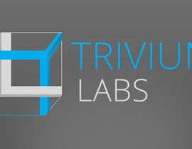
Important: Please just focus on the Cube. We want you to polish the logo but retain the 'Impossible nature' of the Cube. Also, T &L should come out clearly in the symbol as is in the attached brief.
Introduction:
Trivium Labs is an innovation studio for clients and well as for users. We intend to develop innovative software solutions combining creativity, engineering and business intelligence.
What are we looking for:
We are looking for help in refining and finalising the logo idea for Trivium Labs. The logo should feature a symbol and the text 'Trivium Labs'. The rough sketch of symbol is present in the pdf. Please use it as inspiration.
The logo will be leveraged to shape our corporate identity. We will use the logo on our products, online presence, marketing communications etc. We expect our logo to be easily recognisable and unique.
For the logo, we have taken inspiration from M.C. Escher’s Impossible Cube to explore our logo symbol. http://en.wikipedia.org/wiki/Impossible_cube. Professionally, we want to merge creativity, engineering and business which often can be impossible, just like the impossible cube but we aspire to accomplish this. Also, the word ‘trivium’ is a Latin term meaning "the three ways" or "the three roads" forming the foundation of a medieval liberal arts education. In medieval universities, the trivium comprised the three subjects that were taught first: grammar, logic, and rhetoric.
The Verge has done something similar with the Penrose triangle http://www.theverge.com/ http://en.wikipedia.org/wiki/File:The_Verge_logo.svg
We want a logo with a symbol. The logo should highlight the initials of Trivium Labs (T & L) and should be created through the Escher's cube in the way illustrated in the attachment.
Notice that you can change the angle, length, distance between the T & L by rotating the cube across x, y and z axes. Feel free to experiment with colors, angles, shadows, perspective or mixing other shapes with this (circle outside? Hexagon? )
Color & palette:
We am inclined to have this a bit more colorful. Multi-color logos generally stand for variety (Google etc.). I guess having variations of primary colors (CMYK, RGB) along the edge-planes of T & L could work with rest of the logo in single color (preferably, less vibrant - gray, brown. light blue etc.).
This might have implications on the overall color palette so feel free to experiment.
While we prefer a flat-design look, I am not sure how that would impact shadows (or should there even be shadows here).You can try and experiment to see what looks better.
Rest of the logo (text for trivium labs) should preferably in lower case.
Important:
1. Please provide the logo in white, black and light gray or light blue background for comparison.
2. Have another version of the logo in grayscale.
Feel free to get creative, bring fresh ideas, challenge and question us.
Cheers!
Trivium Labs
Recommended Skills
Public Clarification Board
How to get started with contests
-

Post Your Contest Quick and easy
-

Get Tons of Entries From around the world
-

Award the best entry Download the files - Easy!