I need a logo designed for a Fitness Competition
- Status: Closed
- Prize: $300
- Entries Received: 198
- Winner: zetabyte

Contest Brief
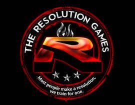
I need a logo designed for a fitness competition. This is going to be a CrossFit type competition. The name of the competition is "The Resolution Games" The logo needs to include the name of the competition. It should also include a symbol of some sort id possible.
Our primary preference for color is red, black and grey (or silver). However we are open to any color combination.
We are also open to any style for the logo. We are not exactly sure what we want but we are quick to give feedback on your designs.
***
Update 6/7/2013
I am starting to get the same design (Icons) over and over again so I have sealed the contest. I kind of like the Icons looks as we do have many different excercises.
However, I want to explore some more design options. I wanted to see if some people could feature the Letter R a little more prominently in their designs. I have uploaded some photos of the Letter R which look pretty cool. Can someone take the Letter R and feature it in one of their designs? Either a big R centered in the background or just a big R to start the Word.
****
About The Resolution Games:
The Resolution Games will be take place near the first of the year. The premise of this competition is to not wait until the first of the year to make a resolution. A resolution is a commitment that an individual makes to a project or the reforming of a habit, often a lifestyle change. IE... our slogan is something like... "Most people make a resolution, we train for one"
For more information on CrossFit please visit: http://en.wikipedia.org/wiki/CrossFit
Recommended Skills
Employer Feedback
“@zetabyte won the contest on 26 June 2013”
![]() richmondarn, United States.
richmondarn, United States.
Public Clarification Board
-

rashedhannan
- 10 years ago
really fantastic work.......@zetabyte
- 10 years ago
-

whitecat26
- 10 years ago
please UNSEAL the cotnest to see the winner if choosen thnx a lots
- 10 years ago
-

alizainbarkat
- 10 years ago
plzz annonce result plzz fast :D we are wattting thank you .......
- 10 years ago
-

liouzhiguang
- 10 years ago
sultandesign is a scammer.
1. I have evidence to prove it.
2. I can pay $10 for the employer who do not choose this guy.
Thanks for your help.- 10 years ago
View 1 more message
-

ijimlyn
- 10 years ago
liuzhigung, stop crying bro you look like a moron. . . move on! It's not sultan's fault it's yours.
- 10 years ago
-

sultandesign
- 10 years ago
We solve our misunderstanding. thanks
- 10 years ago
-
whitecat26
- 10 years ago
Hi CH, dont waste your money, please pick up the winner if its not to late already! Just friendly advice as designer to contest holder, other wise money goes !
- 10 years ago
-
alizainbarkat
- 10 years ago
plzz selected winner thank you
- 10 years ago
-
rashedhannan
- 10 years ago
check my new entries and check the Private Message please.........
- 10 years ago
-

Contest Holder - 10 years ago
A lot of people are including body building type symbols. For example, people posing and flexing their biceps. A CrossFit Competition is not a body building competition it is a fitness competition. The designs that have graphics with people lifting weight overhead is fine.
Some other common CrossFit elements which you can include in the design if you want:
1) kettlebells
2) barbells
3) pullup racks
4) wall balls
5) jump ropes
6) dumbells
7) crossfit rings
8) Olympic lifts including Snatch and Clean and Jerk. (These lifts both finish with a person holding a bar with weights over their head.)
9) Additionally, our Competition is one of the only ones to include swimming.- 10 years ago
-
sultandesign
- 10 years ago
Please wait for my entry.....
.
.
.- 10 years ago
-
liouzhiguang
- 10 years ago
Dear Employer, Please do not choose Sultandesign. He is a scammer.
- 10 years ago
-
whitecat26
- 10 years ago
Ooooops......... here tooo.... good work man.......
- 10 years ago
-
liouzhiguang
- 10 years ago
Never choose him.
Thanks for help[ing me.- 10 years ago
-

mywebworkscenter
- 10 years ago
Please give a feedback for entry #167 and #168 Thanks!
- 10 years ago
-
sultandesign
- 10 years ago
Please don't believe the rumours posted by liouzhiguang. Please have a look at my feedback, he gave me five stars after I won his contest and delivered all the file accordingly. If I scammed him how left me with five stars? I don't know why he is posting this bad rumours against me but please do not trust liouzhiguang. I am a professional and qualified graphic designer and working in this field last 10 years. I have been doing good job by winning and having good feedback. Now he wants to ruin my reputation by saying all these rubbish. DO NOT BELIEVE HIM PLEASE!
- 10 years ago
-

tripranav
- 10 years ago
And #161
Also if you can see I am keeping the basic design the same, just giving you different effect options with the letter 'R'. If you would like me to modify the overall design as well, do let me know. I am up for the task :)- 10 years ago
-
tripranav
- 10 years ago
Please check #159 and #160
I am currently trying to play with some other effect to make the letter 'R' prominent. Will submit the next design ASAP :)- 10 years ago
-

srijanshakya
- 10 years ago
please check my new design #158 thanks.
- 10 years ago
-
Contest Holder - 10 years ago
I am starting to get the same design (Icons) over and over again so I have sealed the contest. I kind of like the Icons looks as we do have many different exercises.
However, I want to explore some more design options. I wanted to see if some people could feature the Letter R a little more prominently in their designs. I have uploaded some photos of the Letter R which look pretty cool. Can someone take the Letter R and feature it in one of their designs? Either a big R centered in the background or just a big R to start the Word.- 10 years ago
-
srijanshakya
- 10 years ago
dear CH please check my designs #150 #151 ...feedback appreciated. thanks..
- 10 years ago
-
tripranav
- 10 years ago
@richmondarn Hi, did you like #116 ?
- 10 years ago
-

pong10
- 10 years ago
please check #147 thank you
- 10 years ago
-
srijanshakya
- 10 years ago
please check and review #145 thanks
- 10 years ago
-
pong10
- 10 years ago
please review #144 thank you
- 10 years ago
-
tripranav
- 10 years ago
- 10 years ago
-
pong10
- 10 years ago
please check also #126 thank you
- 10 years ago
-
pong10
- 10 years ago
please check #125 thank you
- 10 years ago
-

vinu91
- 10 years ago
- 10 years ago
-
tripranav
- 10 years ago
- 10 years ago
-
vicked
- 10 years ago
Please have a look at #114 and #115 and provide your feedback.
- 10 years ago
-
FreeLander01
- 10 years ago
#113 Please Check
- 10 years ago
-
vinu91
- 10 years ago
- 10 years ago
-
tripranav
- 10 years ago
- 10 years ago
-
mywebworkscenter
- 10 years ago
Please check entry #103 I've changed the font. Thanks!
- 10 years ago
-
mywebworkscenter
- 10 years ago
Please check entry #56 Thanks!
- 10 years ago
-
Contest Holder - 10 years ago
HAs potential but I do not like the font.
- 10 years ago
-

atikur2011
- 10 years ago
Please Check #101
- 10 years ago
-

crazypyxl
- 10 years ago
Please wait for my entry :)
- 10 years ago
-
FreeLander01
- 10 years ago
#98 Please Check
- 10 years ago
-
theartofdan
- 10 years ago
Please review first entry #96 . Take a look and share your thoughts in regards to this new approach for your logo. Gathered input from local trainers in the Chicago land area to gain insight on your logo and crossfit training in general. Enjoy!
- 10 years ago
-

mufarizi08
- 10 years ago
pls review #92
- 10 years ago
-
Contest Holder - 10 years ago
Not my style.
- 10 years ago
-

izzrayyannafiz
- 10 years ago
pls view # 88
- 10 years ago
How to get started with contests
-

Post Your Contest Quick and easy
-

Get Tons of Entries From around the world
-

Award the best entry Download the files - Easy!