Logo for Fitness app

Contest Brief

Hello Designer,

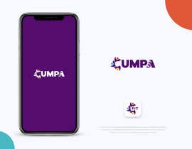
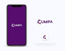
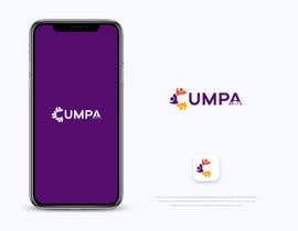
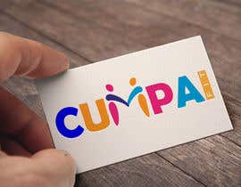
Cumpa is a booking app for fitness activities. Cumpa means Buddy, Friend, Pal!

I need,
Favorite and notification icon
A wordmark
An abstract mark or maybe pictorial mark
A combination mark

Needs to transmit something related to frienship, sharing or more related to fitness, that depends on your design, but it must feel friendly, not childish.
Keep it simple with the information necessary.

Look and feel should point to gym members

Think in use cases, a sticker for the gym door, a sticker for the cellphone or car, a t-shirt, a banner, a flyer

Recommended Skills

Employer Feedback

“Definitely the best designer I have ever work with! thank you!”

Profile image Marce230006, Argentina.

Public Clarification Board

  • biswasshuvankar2
    biswasshuvankar2
    • 4 years ago

    interesting and good choice ready your other contest, Thanks

    • 4 years ago
  • Marce230006
    Contest Holder
    • 4 years ago

    I'd like to thank you all! This was an awesome contest, full of high quality entries. Thanks a lot for your comments that helped me a lot on my decision! Hope to see you on the next one soon! Regards

    • 4 years ago
    1. CreativeRonykhan
      CreativeRonykhan
      • 4 years ago

      Thanks for your project,,

      • 4 years ago
  • biswasshuvankar2
    biswasshuvankar2
    • 4 years ago

    check #603

    • 4 years ago
  • biswasshuvankar2
    biswasshuvankar2
    • 4 years ago

    #602

    • 4 years ago
  • poroshkhan052
    poroshkhan052
    • 4 years ago

    please check #592

    • 4 years ago
  • TEDesign48
    TEDesign48
    • 4 years ago

    Hey most of the logo designs that looks good they are so simple. Complicated designed logos are not going to look good with the app. You can see that all big companies making their logo simple as possible and also they make a story behind them so logo leaves a mark on the customers mind.

    • 4 years ago
    1. Marce230006
      Contest Holder
      • 4 years ago

      You are right! Got any new idea?

      • 4 years ago
    2. TEDesign48
      TEDesign48
      • 4 years ago

      Yes i have but we need to talk... can you message me?

      • 4 years ago
  • CreativeShakil
    CreativeShakil
    • 4 years ago

    working ! please wait for me . Thanks

    • 4 years ago
  • gt4ever
    gt4ever
    • 4 years ago

    See #568 , #575 thanks

    • 4 years ago
  • moeezshah451
    moeezshah451
    • 4 years ago

    #567

    • 4 years ago
  • biswasshuvankar2
    biswasshuvankar2
    • 4 years ago

    check #537

    • 4 years ago
  • biswasshuvankar2
    biswasshuvankar2
    • 4 years ago

    check #526

    • 4 years ago
  • Marce230006
    Contest Holder
    • 4 years ago

    500 ENTRIES! thats awesome, its really hard to pick one design out of so many good ideas! You are all doing great and is excellent having this bank of designs and contacts for future projects or maybe cumpa re-design. Thank you!

    • 4 years ago
    1. paulsanu222
      paulsanu222
      • 4 years ago

      really thank for your compliment

      • 4 years ago
    2. azizulislam33
      azizulislam33
      • 4 years ago

      Please cheek #483

      • 4 years ago
  • Shakil361859
    Shakil361859
    • 4 years ago

    sir please check my entry #410 #411

    • 4 years ago
  • orchitech67
    orchitech67
    • 4 years ago

    Please Check #502 #504 #506

    • 4 years ago
    1. Marce230006
      Contest Holder
      • 4 years ago

      Too much information, please keep it as simple as posible. On the M I think hands are not needed. Also avoid weight. thank you

      • 4 years ago
  • orchitech67
    orchitech67
    • 4 years ago

    Please Check #502 #504 #506

    • 4 years ago
  • orchitech67
    orchitech67
    • 4 years ago

    Please Check #494 #494

    • 4 years ago
    1. Marce230006
      Contest Holder
      • 4 years ago

      Hi Orchi, its nice, but fit is missing, those people are just shaking hands. Please add some fit to it

      • 4 years ago
  • orchitech67
    orchitech67
    • 4 years ago

    Please Check #494 #494

    • 4 years ago
  • orchitech67
    orchitech67
    • 4 years ago

    Please Check #494 #494

    • 4 years ago
  • Shakil361859
    Shakil361859
    • 4 years ago

    check it sir #410 #411

    • 4 years ago
  • biswasshuvankar2
    biswasshuvankar2
    • 4 years ago

    2 color check it, Thanks.. #485

    • 4 years ago
  • biswasshuvankar2
    biswasshuvankar2
    • 4 years ago

    check #484

    • 4 years ago
  • biswasshuvankar2
    biswasshuvankar2
    • 4 years ago

    and if you need only 2 color so i will make it?

    • 4 years ago
  • biswasshuvankar2
    biswasshuvankar2
    • 4 years ago

    ok i will try

    • 4 years ago
  • biswasshuvankar2
    biswasshuvankar2
    • 4 years ago

    check now #482

    • 4 years ago
    1. Marce230006
      Contest Holder
      • 4 years ago

      I like it! Nice font, colours I like them but dont completely convince me. Like how you solved the fit issue, what if you write fit inside the A?

      • 4 years ago
  • CreativeRonykhan
    CreativeRonykhan
    • 4 years ago

    Sir, Did you like to add GYM equipment,on your logo?

    • 4 years ago
    1. Marce230006
      Contest Holder
      • 4 years ago

      Hi Rony, better if not, just the idea of a two people doing some kind of exercise. Try to make it abstract, simple and modern. And two colours is my best option for now.

      • 4 years ago
  • Shakil361859
    Shakil361859
    • 4 years ago

    check it sir #410 #411

    • 4 years ago
  • biswasshuvankar2
    biswasshuvankar2
    • 4 years ago

    #445

    • 4 years ago
    1. biswasshuvankar2
      biswasshuvankar2
      • 4 years ago

      ok sir i will try please mark star

      • 4 years ago
  • Manaf007
    Manaf007
    • 4 years ago

    Please Check My Entry #415

    • 4 years ago
  • Marce230006
    Contest Holder
    • 4 years ago

    Please try working on some other letter, so we see different ideas. C and U together or just C I might be good for an abstract logo. Also the word FIT can be added somewhere, it could help to strengthen the fit concept. Thanks!

    • 4 years ago
  • biswasshuvankar2
    biswasshuvankar2
    • 4 years ago

    check #446

    • 4 years ago
    1. Marce230006
      Contest Holder
      • 4 years ago

      Hi Shuvankar, I like this one, looks modern! People on the M I think they should look slim, something like your previous design #445 , thank you

      • 4 years ago
  • jahidhasanjh8058
    jahidhasanjh8058
    • 4 years ago

    please check my design #441 #442

    • 4 years ago
  • mdaminul3693
    mdaminul3693
    • 4 years ago

    I hope My design will increase your conversion rate.Please check #438

    • 4 years ago
  • freelancerraisul
    freelancerraisul
    • 4 years ago

    please check my entry no. #437 , I hope you like it. Regards!

    • 4 years ago
  • moeezshah451
    moeezshah451
    • 4 years ago

    #436

    • 4 years ago
  • moeezshah451
    moeezshah451
    • 4 years ago

    please check$435

    • 4 years ago
  • istiaqueahmed413
    istiaqueahmed413
    • 4 years ago

    please check #374

    • 4 years ago
  • Shakil361859
    Shakil361859
    • 4 years ago

    check it sir #410 #411 ...creative design 100% editable

    • 4 years ago
  • paulsanu222
    paulsanu222
    • 4 years ago

    please send me a message for a personal conversation about your logo

    • 4 years ago
  • paulsanu222
    paulsanu222
    • 4 years ago

    Dear CH this my proposal for logo #394 . Hope you like it. Feedback is always appreciated. Any change can be done according to your valuable suggestions. Thank you.

    • 4 years ago

Show more comments

How to get started with contests

  • Post your contest

    Post Your Contest Quick and easy

  • Get tons of entries

    Get Tons of Entries From around the world

  • Award the best entry

    Award the best entry Download the files - Easy!

Post a Contest Now or Join us Today!