

Graphic designers
Website designers
Mobile app developers
Software developers
3D artists
Illustration
Other popular skills
Working with international freelancers

Where to find the best developers

Do you need a local freelancer?
Building an international team
Featured jobs
Explore our current list of excited top featured projects.
Find contests
Unleash your talent and find freelancer contests to enter.
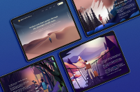
Website jobs
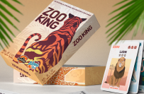
Graphic design jobs
Data entry jobs
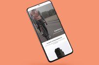
Mobile app development jobs

Internet marketing jobs

Local jobs
Other popular jobs
Find work in different languages
Enterprise
Power your competitive advantage with Freelancer Enterprise.
Field Services
Deliver expertise anywhere in the world at scale - on demand.
AI for business
Let experts in the latest AI technology transform your business.

Freelancer products
Innovation Challenges
Turn challenges into breakthroughs with the largest innovation hub.
Freelancer API
Use the Freelancer API to access a cloud workforce of skilled freelancers.
Local jobs
Get help in any location, anywhere in the world.
Freelancer services
How it works

How to hire the perfect freelancer for your project
Get ideas
How to get started earning money freelancing
Resources
WE Enterprise Logo & Brand Identity Brief
Prize:
$20 USD
Entries Received:
331
23 days, 3 hours remaining
gif, jpeg, jpg, png

Hello sir, i hope you like it. please check
Hello sir, i hope you like it. please check
Hello sir, i hope you like it. please check
Contest Holder
·
Color Recommendations Instead of prescribing one palette, I'd test finalists in these three worlds: Option A: Family Office Luxury (My Favorite) Midnight Navy Vintage Gold Ivory Emotion: Wealth. Legacy. Stability. Option B: Global Lifestyle Deep Emerald Champagne Gold Soft Cream Emotion: Freedom. Travel. Wellness. Option C: Modern Institutional Charcoal Platinum White Emotion: Authority. Intelligence. Timelessness.
Contest Holder
·
Option 5: The Infinity WE Concept Create a continuous-line mark. The W transitions into the E without lifting the line. One motion. One entity. Symbolism Infinite possibilities Continuous growth Seamless partnership Eternal evolution Why It Works Very elegant. Excellent for: Lifestyle brand Hospitality brand Luxury merchandise
Contest Holder
·
? Option 4: The Foundation Mark Concept Use two vertical pillars (the "1s") supporting a modern WE symbol. Visual hierarchy: 1 1 \ / WE (Not literal.) Symbolism The pillars represent: Mr. WE Mrs. WE The resulting structure represents: Legacy Strength Wealth Why It Works Feels institutional. Would appeal to: Investors Banks Real estate partners Weakness Slightly more corporate.
Contest Holder
·
? Option 3: The WE Compass Concept Create a luxury compass-style emblem where: WE forms the center. The compass points represent: Freedom Global living Expansion Exploration Symbolism This supports: Global property network Real estate Wealth Travel Lifestyle Why It Works Extremely scalable. Could sit on: Building signage Resort branding Corporate materials Property entrances Weakness Slightly less connected to the marriage/union story. Score: 8.75/10
Contest Holder
·
? Option 2: The H₂O Monogram Concept Build a WE monogram whose geometry subtly incorporates: H₂O without writing H2O. Example: W creates the H structure E creates movement Center connection represents the "2" No one sees it immediately. Symbolism Transformation Chemistry Creation Emergence The mark almost functions like a secret. Only insiders know its meaning. Why It Works Luxury brands thrive on hidden meaning. This gives Mrs. WE and Mr. WE something unique to explain for decades. Risk May become too clever and lose immediate readability.
Contest Holder
·
I used AI to provide some additional concepts for everyone to consider Option 1: The Transformation Mark Concept Create a monogram where the W and E combine to form a third shape. At first glance: Viewer sees a premium symbol Second glance: Viewer sees WE Third glance: Viewer discovers two vertical pillars subtly forming the "1s" from 1 + 1 = 11 Symbolism Two individuals One unified entity Multiplication Transformation The mark communicates: "Together we become something entirely new." Design Direction Minimalist Geometric Symmetrical Think: Rolex Chase Blackstone Family office level sophistication Why It Wins This most directly captures: Hydrogen + Oxygen = Water without being literal. Score: 10/10
Contest Holder
·
I want to thank everyone for the many ideas...I am reviewing all several times per week and will soon begin to eliminate and rank designs to help narrow down... I wonder if there is a way to incorporate the "1's" in "1+1=11" by using either the outside edges of the "W" or something similar with the horizontal lines in the "E"--now, I'm not sure how to do that but it seems that someone with creativity can subtly and cleverly incorporate this element into this design. Also, rather than explicitly having, "hydrogen + oxygen = water" maybe it would be more clever to use the symbol or chemical abbreviation (i.e., Water = "H2O")--the 2 is a subscript, but you get the idea. These are just ideas that I'm curious if they can be integrated--or maybe there's a better and more creative way to incorporate these idea. Potentially, we're using the term WE and we're designing a mark to represent the brand? This is another viable way to approach the ideas I currently have... Hope this was helpful


Download our mobile app now to ensure you never miss an update on your contests.
1. Post your contest, it's fast and free
Join the thousands of entrepreneurs who are launching their contests every week and harnessing the awesome power of crowdsourcing.
2. Get tonnes of entries
You can request changes and revisions and only pay when you're satisfied.
3. Award the best entry
Award the winning entry and download the files - easy
Freelancer
About
Terms
Partners
Apps