Website Design for International Model
- Status: Closed
- Prize: $1075
- Entries Received: 8
- Winner: WebofPixels

Contest Brief
Hi there, I am looking for a homepage design for my new website.
I am a model hailing from Sydney, who features in magazines, advertisements, and television commercials.
I additionally do a lot of radio and TV work, and occasionally theatre, voice overs, music clips and short films.
I want to put together a classy, professional looking website.
The website will NOT use Adobe Flash, we will use javascript to make it dynamic
This contest is for TWO pages: the home page and the photos page styling.
I want the front page static to be a cross between
http://larabingle.com.au/
http://www.hilaryrhoda.com/
http://henrykphoto.com/index.php#/recent-work/katie1
http://www.juliastegner.com/photography/covers/
The front page should contain an area for a few paragraphs of text so the site can be SEOd well
It will have a menu like Lara's website (above) with about six options
Biography
Fashion/Beauty
Television/Film
Press
Contact
HOMEPAGE
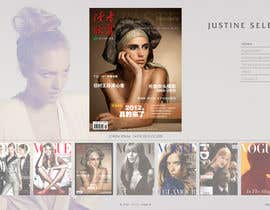
The front page image I want used of myself is attached. I want it simple like Lara Bingle's, but in colour.
My name is "Justine Selby" which should feature prominently.
PHOTO PAGE
I would like the photo carousel (which is not on the homepage) to be like the henryk link above
but with larger thumbnails (the size of Julia Stegner)
See http://www.hilaryrhoda.com/
http://www.juliastegner.com/photography/covers/
I would like the hero image on this page to be large
For this mockup just can you use the thumbs/hero images for the photo page to be from one of these sites.
Thanks! I look forward to seeing your work. Please submit two good resolution static images.
Justine xx
Recommended Skills
Public Clarification Board
-

Contest Holder - 11 years ago
THANK YOU everyone for your wonderful entries :) I now have a VERY big decision to make. I will let you know asap which design I chose, please give me a night to think about it.
Best regards,
Justine- 11 years ago
-

arkcreations
- 11 years ago
Hi there i don\'t know if my entery was actually entered or not, my internet was playing up lol. Anyway it only let me take 2 pictures of my website being created for some reason and wouldn\'t let me take the Photo page. Anyway i created 2 home pages to see which one you liked the most and a photograph page which you can see here http://justineselby.comlu.com/ hope you like!
I can make any change you like- 11 years ago
-

hibernicus
- 11 years ago
are you saying that are only three competitors left -- totally wrong to make it public then I was about to submit but further reading but it seems it is only for the privileged three.
Its suspicious how all of their design are very similar
I think everyone has been had- 11 years ago
-
Contest Holder - 11 years ago
I think your opinions should be kept to yourself. It was open to everyone, no one has been \"had\". How rude of you to suggest that.
- 11 years ago
-

muresanalexandru
- 11 years ago
So if i am getting this right you are going to ignore all the other submisions from the rest of freelancers? And take only into consideration these dudes designs only? Just for me to know so i can go do something else and dont waiste my time with your so called contest. Thank you for your apreciation!
- 11 years ago
View 6 more messages
-

sylvestermolina
- 11 years ago
Again i deleted it already sorry as i forgot i posted it as a mock up design as it is, im flattered as well, you ask designs for all of us. Get our ideas and did not bother commenting? what the? in fact you extended 3 days a while ago with your top designs and you tell the designers to add our design? think for a second Ms. Justine. it is unjust. clear mind blowing excuse to waste the time of other people and still their ideas without getting any in return. It does flatter :D
- 11 years ago
-
Contest Holder - 11 years ago
Flattered is a nice word, you've interpreted my comment incorrectly.
This was a competition, if you're going to be in them you have to be prepared to be rejected.
I wish you luck.- 11 years ago
-

umar101112
- 11 years ago
hi juzyleigh i have send to you design #336 only front page i will send you 2nd page very soon thanks
best regards
umar101112- 11 years ago
-
umar101112
- 11 years ago
hi juzyleigh i hope you fine i have send to you latest design i hope you like front design and i will send you inner page as well as possible soon thanks
best regards
umar101112- 11 years ago
-

crazypyxl
- 11 years ago
Please check PMB, when you can.. Cheers..
- 11 years ago
-

webgik
- 11 years ago
You have extended with 4 days. Can I submit a new design?
- 11 years ago
-
Contest Holder - 11 years ago
Oh hi :) Anyone can as it's the rules but I don't want you or anyone to waste your time as I would feel bad. Only the three designers left should submit. I wish I could chose all the designers!! This is hard!
Thanks,
Justine :)- 11 years ago
-
Contest Holder - 11 years ago
Hi datagrabbers, xexexdesign, WebofPixels. We are getting close. I like the background silver and right hand side of #313 (xexexdesign). But I don't like how there is a filter to me so I look orange and my hair isn't cut properly. I like how #323 (WebOfPixels) has done my image the best, the colour tones and the hair. Also #328 (datagrabbers) did me OK. The typography of my name and kerning is best in #313 (xexex). But I look stretched in #313 which I do not like. I need the image of me to be pretty much EXACTLY has provided, no filters, no changing of my aspect ratio etc. However I do think the background colour of silver is more classy than the brown.
- 11 years ago
-
Contest Holder - 11 years ago
turns out I can't extend the comp till some changes are made, once they are I'll upload the pics I'm talking about ^^^.
Thanks :)- 11 years ago
-

creativeon
- 11 years ago
Comment on 327, maybe?
- 11 years ago
-
Contest Holder - 11 years ago
very nice but not what I"m looking for, thank you
- 11 years ago
-
Contest Holder - 11 years ago
WebofPixels #182 try the whole picture in the background as you have done in the first page.
xexexdesign #287 try putting an image in the background and include a contents page. and 286 put less text please.
datagrabbers and everyone try making two versions of the front page 1 with all the writing white and 1 with all the writing black. As I've has mixed feedback about the writing, thanks.
That's it for now, thanks!- 11 years ago
-

PolyTechStudio
- 11 years ago
You're the CEO's girlfriend, right? Good on you for using Freelancer. :)
- 11 years ago
-
Contest Holder - 11 years ago
:)
- 11 years ago
-
creativeon
- 11 years ago
I realize that I am late to the party but just in case you're still interested in checking some new layout / design, kindly give entry 312 a look and thought. Thank you.
- 11 years ago
-

jwimpsweb
- 11 years ago
Hi Selby Please Check Entry #296 and #297..Ready to do modifications as per your needs. Please Acknowledge
- 11 years ago
-
Contest Holder - 11 years ago
Hey :) So I'm uploading the final ones you guys did that I really like and will comment on them publicly. I think one thing that has to be 100% is my hair- not any of the little strands cut out or changed in anyway... maybe crop completely around the hair. As I really like the way the stylist made it! :)
- 11 years ago
-
muresanalexandru
- 11 years ago
Hello Miss, please review the #288 submision for main page and photo gallery page i hope this time my wok is raiseing to your expectations. Awaiting your feedback. Thank you!
- 11 years ago
-
PolyTechStudio
- 11 years ago
Hey Justine.
I've uploaded 2 homepage designs - if you like what you see, let me know and I'll move onto the photo page.
My favourite homepage design is the white one. I can make amendments where necessary.
Thanks!- 11 years ago
-
Contest Holder - 11 years ago
datagrabbers, WebofPixels, & xexexdesign I have uploaded your work that is my favorite. I hope this helps with vision of what I mean :)
- 11 years ago
-
Contest Holder - 11 years ago
I like the font in capture 6, the layout of capture 1, and page 2 capture 5 is what I like. Thanks. Oh and it could be cool to see an option of my picture a little smaller. Thanks!
- 11 years ago
-

theDesignerz
- 11 years ago
Please provide feedback on #264. Thanks
- 11 years ago
-
Contest Holder - 11 years ago
Hey datagrabbers, WebofPixels, & xexexdesign I've extended the contest by 3 days but only to you 3 as your designs were the best (of my taste). I'm not 100% at where I want to be with the site just yet (hence the extension). I'll be back in one hour to list my edits. Thanks so much!
Everyone else, thank you ALL so much for your help along the way:)- 11 years ago
-
Contest Holder - 11 years ago
I believe it's now open? Can you see all the designs?
- 11 years ago
-

WebofPixels
- 11 years ago
Not yet. The "Sealed" option is the one that prevents others from seeing the designs!!
- 11 years ago
-
sylvestermolina
- 11 years ago
Thank you for the extension.
- 11 years ago
-
sylvestermolina
- 11 years ago
Entries 114 and 142. Thanks
- 11 years ago
-

elshahat
- 11 years ago
Hi Ms. Justine
Please Feedback about #238 and #239
Best Regards,
Elshahat- 11 years ago
-
elshahat
- 11 years ago
Hi Ms. Justine
Please Feedback about #205 and #206
Best Regards,
Elshahat- 11 years ago
-

croscris
- 11 years ago
Hi Ms. Justine please have a look at my new entries:
#178 #179 #180
Thanks.- 11 years ago
-

vijayadesign
- 11 years ago
Please give feedback for #217 & #218
- 11 years ago
-
vijayadesign
- 11 years ago
Please give feedback for #213
- 11 years ago
-
elshahat
- 11 years ago
Hi CH,
I changed direction of view
I'd like to know your feedback
#205 , #206
I hope you like this
Best Regards,
Elshahat- 11 years ago
-
elshahat
- 11 years ago
What about changes in
#150 , #151 , #152 , #153 , #154
Waiting your feedback
Best Regards,
Elshahat- 11 years ago
-

pris
- 11 years ago
Hi, Please check pmb. Thanks!
- 11 years ago
-

zulqarnayen
- 11 years ago
Hi Justine
Have a look a live preview of my webpages here:
http://zulqarnayen.net76.net/index.html
http://zulqarnayen.net76.net/fashionbeauty.html
http://zulqarnayen.net76.net/press.html- 11 years ago
-
zulqarnayen
- 11 years ago
PS: you will have the best viewing experience on a widescreen display with your browser zoom set to 100 percent.
- 11 years ago
-
zulqarnayen
- 11 years ago
Hi Justine, please have a look at my entries:
homepage: #174
Slideshow Thumbnail #175
slideshow lightbox #176
image pops up when you click on a thumbnail #177
I used css and java script (NO FLASH)
All texts are live (no text has been converted into image)- 11 years ago
-

yadbinder
- 11 years ago
Please rate and feedback #171 and #172
- 11 years ago
-
webgik
- 11 years ago
Please rate and feedback #145 and #146
- 11 years ago
-

patil1987
- 11 years ago
Can you feedback #160. Thanks
- 11 years ago
-
patil1987
- 11 years ago
Hi
- 11 years ago
-
Contest Holder - 11 years ago
I think #86 would look best with a silver background on the 2nd page (background to the row of pics and feature pic). #85 My name and the contents column would look better bolder/ more prominent.
#87 just take out the row of pics as it is only to be on the 2nd page (not 1st) and put in a block of text (I will later finalise that actual words). Also have the graphic go to the edge of the screen (not cropped or bordered). The heading & contents could be a bit clearer also.
#75 same thing about the boarder. And put in text...
125 & 123 I really like the 2nd page, you've both done as specified in the brief.
Most of you have either used a strong font or a running writing font. It's hard to decide which is best as they're great for different reasons. That won't influence the final decision as it can be changed.- 11 years ago
How to get started with contests
-

Post Your Contest Quick and easy
-

Get Tons of Entries From around the world
-

Award the best entry Download the files - Easy!