Design a logo for a health site
- Status: Closed
- Prize: $30
- Entries Received: 8
- Winner: mohdyk1

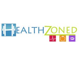
Contest Brief
Hello,
My website is http://healthzoned.com/ .
I would preffer the logo to contain a dumbell shape for the H letter and be really slick.
The website doesn't really need to have the standard leaf that every health site has. I prefer more minimalistic, smart and sharp, brandable logo. It's your decision anyway. If it looks good you can break all the rules.
IT can be 2d, 3d doesn't matter.
Rememeber that my website color pallette might change. In regards to that, if you have any ideeas of how i could change the colors to better suit my site i will listen.
I am looking forward to see your designs.
Best regards,
Paul Posea
Recommended Skills
Employer Feedback
“Grea work from a great guy!”
![]() lpalegrim, Romania.
lpalegrim, Romania.
Public Clarification Board

How to get started with contests
-

Post Your Contest Quick and easy
-

Get Tons of Entries From around the world
-

Award the best entry Download the files - Easy!